

En los últimos años he trabajado con equipos que viven en un contexto muy distinto al de las típicas startups SaaS: banca corporativa, múltiples divisas, regulaciones estrictas y usuarios que no perdonan un flujo roto. Monex Móvil, la app de Banco Monex para consultar saldos, operar movimientos, comprar y vender divisas, pagar a cuentas registradas y contactar al asesor desde el teléfono, fue el proyecto donde entendí de verdad qué significa diseñar producto en un entorno financiero empresarial.
Este artículo no trata sobre cómo construir una app bancaria desde código. Trata sobre cómo diseñar una experiencia financiera compleja para que tenga sentido antes de llegar a desarrollo. Mi participación fue dentro del equipo de diseño de Aurin (estudio de producto en Cuernavaca), en coordinación con Ancient Global (opens in new tab) como partner de desarrollo para Banco Monex. Ocho meses de trabajo: wireframes de baja fidelidad, arquitectura de flujos, UI de alta fidelidad y handoff. Un año después, la app estaba en App Store.
La descripción de producto sigue la ficha pública de Monex Móvil en App Store (opens in new tab) y el portal Monex One (opens in new tab). Ancient documenta experiencia en Banking & Fintech (opens in new tab) y oficinas en Cuernavaca y CDMX. Los marcos de UX (progressive disclosure, journeys, tokens) citan fuentes estándar en la tabla de referencias al final.
Contexto: banca corporativa desde Cuernavaca
> En pocas palabras: Tres actores (banco, diseño local, desarrollo nearshore) y un producto que tenía que sentirse global pero operar primero en México.
Banco Monex es una institución con presencia internacional y operación fuerte en México. Su división móvil no apunta al usuario que “descarga una app y abre cuenta en cinco minutos”: apunta a clientes que ya operan con el banco, tienen cuentas activas, asesor asignado y necesitan eficiencia, no descubrimiento.
Aurin fue el estudio donde trabajaba: diseño de producto con mentalidad corporativa, ritmo de entregables y coordinación entre varias disciplinas. Ahí aprendí el UX institucional más que en cualquier otro cliente, no por glamour de fintech startup, sino por volumen de restricciones reales: compliance, semántica legal, estados de error que no pueden ser ambiguos.
Ancient Global asumió el desarrollo. Empresa fundada en 2014, con presencia en EE.UU. y México (incluyendo Cuernavaca y CDMX), orientada a software a medida en sectores como banca y fintech. En este proyecto, el contrato de diseño → desarrollo tenía que ser explícito: lo que definíamos en Figma no podía quedar como interpretación en código.
El equipo de diseño no era pequeño: seis UI designers, dos UX y un equipo de diseño gráfico dedicado a assets. Eso cambia el problema: no es “hacer pantallas”, es gobernar consistencia cuando muchas personas pintan al mismo tiempo.
El reto de producto: prestigio, complejidad y foco en México
> En pocas palabras: La app tenía que transmitir solidez institucional sin sentirse como banca web del 2010 comprimida en un iPhone.
Monex Móvil, según su descripción pública, permite:
- Acceder a cuentas de Banco Monex con consulta de saldos y movimientos en tiempo real.
- Realizar compra-venta de divisas con cotizaciones actualizadas.
- Ejecutar pagos a cuentas previamente registradas en bancos de México y gestionar operaciones nacionales/internacionales.
- Contactar al asesor asignado y conectar con la Banca Digital Monex como canal principal.
Eso suena como cuatro bullets. En diseño de producto son cuatro dominios de riesgo distinto: lectura (baja fricción), trading (alta atención), pagos (irreversibles) y soporte humano (confianza). Mezclarlos mal en navegación es cómo las apps bancarias se vuelven “todo en un menú hamburguesa”.
La tensión central del proyecto era de posicionamiento:
| Dimensión | Presión del negocio | Presión del diseño |
|---|---|---|
| Alcance | Cubrir operaciones de un cliente corporativo completo | Mantener tareas diarias en pocos toques |
| Confianza | Marca global, seguridad visible | UI que no grite “marketing” sobre utilidad |
| Mercado | Operación México primero | Flujos que escalen sin re-diseñar identidad |
| Equipo | Muchos diseñadores en paralelo | Un solo lenguaje visual y semántico |
En banca, diseñar bien no es adornar flujos; es reducir riesgo cognitivo en operaciones sensibles. Cada pantalla intermedia, cada label de confirmación y cada estado vacío es una decisión de producto, no de decoración.
Del “super app de divisas” al MVP bancario
> En pocas palabras: La visión inicial era amplia; el lanzamiento tuvo que proteger lo que el cliente usa todos los días.
Al inicio, el alcance conversacional apuntaba a algo más ambicioso: una experiencia móvil que concentrara operaciones de divisas, pagos y consulta en un solo producto “completo”, casi un super app financiero para el cliente Monex. Eso es común en discovery bancario: el mapa de deseos del negocio siempre es más grande que el primer release seguro.
El diseño de producto entró cuando hubo que recortar sin amputar confianza. No se trataba de “quitar features hasta que quepa en el sprint”. Se trataba de identificar:
1. Journeys núcleo: consulta de saldo/movimientos, operación FX, pago a beneficiario registrado. 2. Journeys de soporte: contacto con asesor, acceso a banca digital. 3. Journeys diferidos: funcionalidades que requieren más validación regulatoria, más estados de error o más educación al usuario.
Ese recorte es diseño de producto en su forma más honesta. Qubstudio (opens in new tab) y estudios de rediseño bancario repiten el patrón: los equipos que retienen usuarios no shippean todo el roadmap; shippean los journeys que sostienen la relación diaria con el banco.
Lo que protegimos en el MVP:
- Legibilidad de dinero: saldos y movimientos claros, sin ambigüedad de moneda.
- FX con pasos explícitos: compra/venta como secuencia, no como formulario único.
- Pagos solo a cuentas registradas: reduce fraude y simplifica confirmación.
- Puente al asesor: el producto móvil no finge ser autosuficiente en todo.
Lo que quedó explícitamente como evolución post-lanzamiento (visible hoy en el historial de versiones de App Store: estados de cuenta, crédito, seguridad reforzada, validación de identidad) refuerza la tesis: un MVP bancario bien diseñado no es estático; es una plataforma de confianza que puede crecer.
Resultados después del lanzamiento
> En pocas palabras: No tengo métricas públicas del banco; sí señales cualitativas de que el enfoque de flujos sostuvo producción y evolución.
| Señal | Qué indica para diseño de producto |
|---|---|
| App Store en ~12 meses tras 8 meses de diseño | El handoff flujo → UI → dev fue ejecutable; no quedó en deck |
| Releases posteriores sin rehacer navegación | La arquitectura de journeys del MVP escaló (estados de cuenta, seguridad, identidad) |
| Menos ida y vuelta en FX y pagos tras cerrar semántica en wireframes | Stakeholders de negocio dejaron de pedir “otra pantalla” cuando el problema era vocabulario |
| Iteraciones visibles en App Store | El producto sigue creciendo sobre la misma lógica de steppers y confirmación |
En retrospectiva, el outcome más valioso no fue una pantalla hero: fue que operaciones sensibles compartieran el mismo patrón mental (resumen, riesgo, confirmación, comprobante). Eso redujo fricción interna entre diseño, negocio y desarrollo, y dejó un lenguaje común para priorizar lo que entraba en cada release.
Arquitectura de flujos y semántica de la experiencia
> En pocas palabras: Antes de alta fidelidad, validamos que cada pantalla respondiera a una tarea, no a un requerimiento del documento de negocio.
Mi trabajo empezó en la capa que muchos equipos saltan: semántica y conexión entre pantallas. Wireframes de baja fidelidad para acordar:
- Qué tarea inicia el flujo (consultar, operar, pagar, pedir ayuda).
- Qué información es obligatoria en cada paso, y cuál puede esperar.
- Qué estados existen: éxito, pendiente, rechazado, mercado cerrado, sin conexión, sesión expirada.
- Cómo se cierra el flujo: confirmación, comprobante, retorno al inicio.
En banca, la semántica es contrato. Si un botón dice “Continuar” cuando el usuario cree que ya ejecutó la operación, el problema no es copy, es pérdida de confianza. Por eso definimos vocabulario consistente entre UX y UI: mismos verbos para mismas intenciones en FX, pagos y onboarding de servicios.
Micro-historia: el FX que “ya estaba comprado”
En wireframes de compra USD, el CTA del paso de cotización decía “Continuar”. En prueba interna con el equipo de producto, varios participantes dijeron que “ya habían comprado” y buscaban el comprobante. No fallaba el layout: fallaba el contrato semántico.
Lo que cambiamos:
- CTA a “Revisar operación” en el paso de cotización.
- Indicador explícito paso 2 de 4 en el stepper.
- Resumen sticky con monto, par de divisas y tipo de cambio antes del tap final.
Negocio aceptó el ajuste cuando lo planteamos como menos llamadas al asesor por dudas post-pantalla, no como “preferencia de diseño”. Esa conversación me enseñó que en banca corporativa el copy es infraestructura.
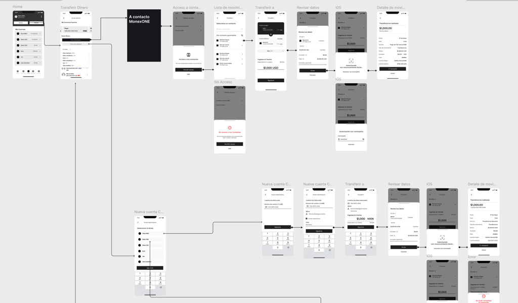
El flujo Transferir dinero muestra cómo se veía esa arquitectura en artefactos de UX: contacto MonexONE, revisión de datos, confirmación, detalle de movimiento y ramas de error (sin acceso, autenticación, cuenta nueva). Datos anonimizados; la lógica es la que importa.
Acceso: login, token OTP y recuperación
Antes de operar dinero, el usuario cruza una capa de autenticación que no puede sentirse como fricción gratuita. Documentamos tres escenarios en UI: login recurrente (segunda vez en adelante), verificación con token OTP (con temporizador y estados de error como “El token no coincide”) y reinstalación de la app, cuando el usuario borra Monex Móvil y debe reactivar credenciales sin perder confianza en el banco.
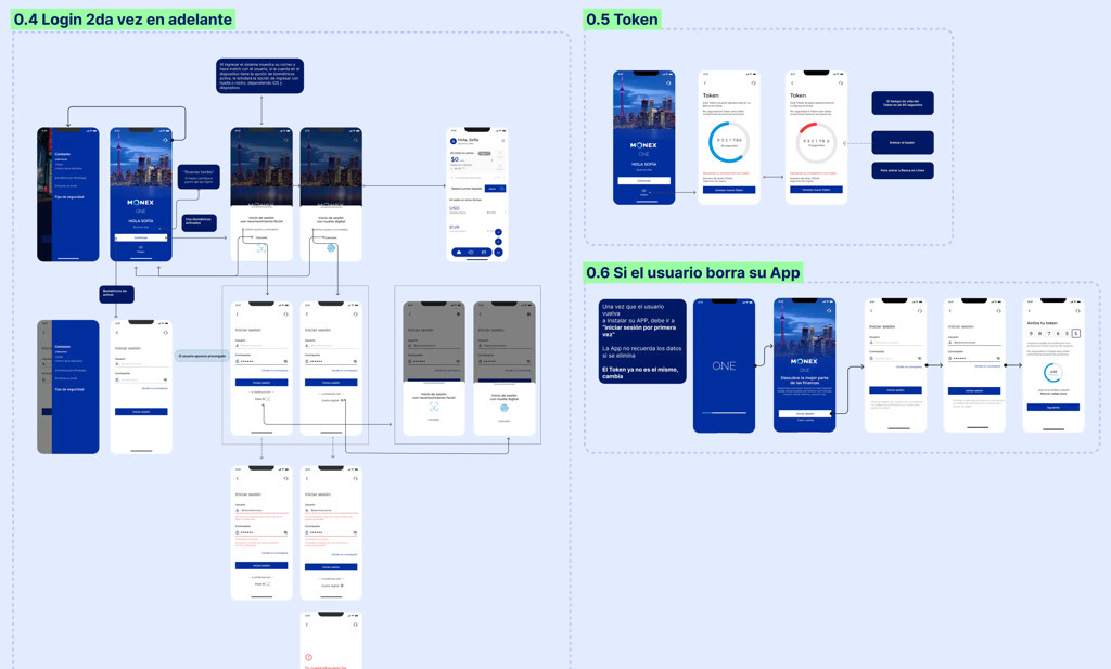
El patrón es el mismo que en pagos o FX: pasos legibles, errores accionables y cierre claro. La seguridad no compite con la usabilidad; la secuencia las alinea.
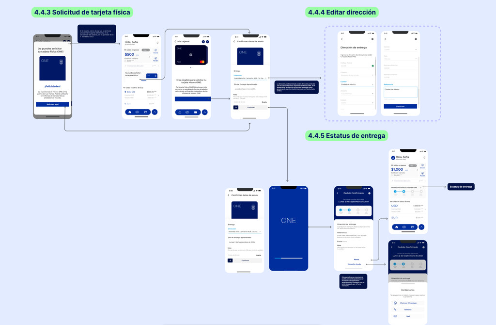
Solicitud de tarjeta, verificación de identidad y activación de token, flujos que aparecieron o se reforzaron en releases posteriores, siguen el mismo patrón: tareas largas partidas en estados legibles. El diseño no los “simplifica” ocultando pasos regulatorios; los secuencia con progreso visible.
Progressive disclosure en flujos sensibles
> En pocas palabras: Mostrar solo lo necesario en cada paso, especialmente cuando hay dinero y tipo de cambio de por medio.
Progressive disclosure (opens in new tab), el patrón clásico de Nielsen Norman Group, recomienda revelar información y controles de forma gradual para no sobrecargar. En fintech aplica tres variantes que usamos en Monex:
| Tipo | Qué es | Ejemplo en banca móvil |
|---|---|---|
| Contextual | Mostrar detalle bajo demanda | Desglose de comisión o tipo de cambio |
| Por etapas (staged) | Wizard / stepper | Compra-venta de divisas en pasos |
| Habilitación progresiva | Controles que aparecen cuando aplica | Campos de beneficiario tras elegir moneda |
La compra-venta de divisas es el caso de estudio interno perfecto. Un solo formulario con cotización, monto, cuenta origen, cuenta destino, disclaimer legal y CTA habría cumplido el requerimiento funcional, y habría fallado en usabilidad. El stepper no es decoración: es control de atención. Cada paso tiene una pregunta dominante:
1. ¿Qué quieres hacer (comprar / vender)? 2. ¿Con qué montos y a qué cotización estás de acuerdo? 3. ¿Desde y hacia dónde se mueve el dinero? 4. ¿Confirmas que entiendes el resultado?
LogRocket (opens in new tab) resume por qué staged disclosure reduce errores en tareas complejas, coincide con lo que vemos en apps bancarias que sobreviven auditoría de usabilidad.
Lo mismo aplica a errores: un mensaje técnico en rojo no es UX. Diseñamos jerarquía en tres capas:
| Capa | Ejemplo | Acción del usuario |
|---|---|---|
| Qué pasó | “Mercado de divisas cerrado” | Entiende el bloqueo sin código de error |
| Qué puede hacer | “Programar para mañana 9:00” o “Ver horario” | Tiene salida sin llamar aún |
| Cuándo escalar | “Contactar a tu asesor” | Solo si la operación no tiene workaround digital |
En corporativo “intenta de nuevo” no siempre es válido. El organismo de error compartía tokens y estructura con el resumen de confirmación: el usuario reconoce el mismo “marco” en éxito y fracaso.
Research, journeys y pruebas de usabilidad
> En pocas palabras: En banca no alcanza con “creemos que está claro”; hay que validar tareas, no pantallas sueltas.
UXDA (opens in new tab) agrupa métodos de research financiero: entrevistas, encuestas, pruebas de usabilidad, análisis de soporte y datos de uso. En Monex, el contexto corporativo limitaba research abierto con clientes finales, pero el equipo sí podía:
- Mapear journeys por tipo de cliente (operador frecuente vs consulta ocasional).
- Ejemplo: el operador FX entraba por “operar”; el consultor ocasional por “saldos”. Dos entradas, mismo home.
- Validar wireframes con stakeholders de producto y negocio antes de alta fidelidad.
- Ejemplo: negocio pidió “más datos” en confirmación; research interno mostró que el exceso aumentaba abandono en paso 3.
- Revisar semántica con compliance como input de diseño, no como veto final.
- Ejemplo: disclaimers legales movidos a progressive disclosure contextual, no bloque de texto fijo en cada paso.
- Probar prototipos en tareas críticas: “consulta saldo”, “compra USD”, “paga a beneficiario X”.
Un journey map en banca no es ilustración de marketing. Es herramienta de priorización: dónde el usuario duda, dónde abandona, dónde llama al asesor. Qubstudio (opens in new tab) insiste en mapear journeys antes de rediseñar: mapa → wireframe → UI → handoff.
A/B testing en entornos regulados es más estrecho que en e-commerce. Hipótesis relativamente seguras:
- Orden de información en confirmación (monto antes vs después del disclaimer).
- Densidad del resumen de operación.
- Iconografía de estados y microcopy de error.
Lo que casi nunca se testea sin salvaguardas: ejecución financiera real. El diseño maduro distingue qué es experimentable de qué es contractual.
Componentes, Atomic Design y pensar en sistemas
> En pocas palabras: Con seis UI designers, el enemigo es la deriva visual, no la falta de talento.
Atomic Design (opens in new tab) (Brad Frost) propone cinco niveles: átomos, moléculas, organismos, templates, páginas. En Monex lo usamos como lenguaje de coordinación, no como buzzword:
| Nivel | Ejemplo en Monex Móvil |
|---|---|
| Átomos | Tipografía de monto, icono de moneda, estado de campo |
| Moléculas | Fila de movimiento, input de monto con moneda |
| Organismos | Resumen de operación FX, módulo de confirmación |
| Templates | Pantalla de stepper con slot de acción fija |
| Páginas | Flujo completo compra USD con datos reales |
La capa de UI en alta fidelidad muestra cómo esos organismos y templates se ven en producción: home multi-divisa, tarjetas física/virtual, actividad con filtros y paridad claro/oscuro. Mismo sistema visual, distintos dominios de riesgo.
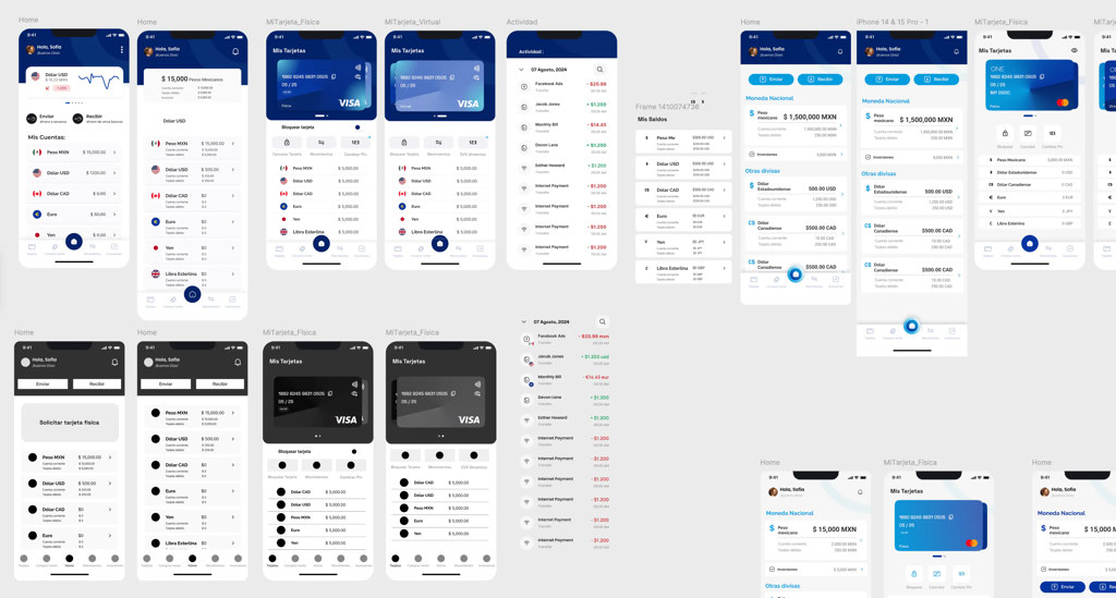
Frost insiste: construye sistemas, no páginas. En un banco eso se traduce en que la pantalla de confirmación de un pago y la de una operación FX comparten el mismo organismo de “resumen + riesgo + CTA”, el usuario aprende una vez.
Con seis UI designers, el sistema en Figma era el acuerdo social: qué componentes existen, qué variantes están permitidas, qué estados son obligatorios (loading, disabled, error, success). Sin eso, cada diseñador resuelve el mismo problema de forma distinta, y Ancient recibe handoffs inconsistentes.
FX, pagos y altas de servicio usaban el mismo organismo. El usuario aprende una vez; el equipo documenta una vez.
Design tokens y reproducibilidad del sistema
> En pocas palabras: Tokens son cómo el diseño sobrevive al tiempo, y a equipos grandes.
El Design Tokens Community Group (DTCG) (opens in new tab) define tokens como decisiones con nombre y valor, independientes de la herramienta. En Monex no buscábamos un design system open source como en proyectos posteriores (design system que se shippea solo), pero la lógica era la misma:
| Familia | Token (ejemplo) | Por qué importa en banca |
|---|---|---|
| Color semántico | text.amount, surface.error | El monto y el error se leen igual en FX y pagos |
| Espaciado | space.stack.tight / loose | Densidad para cifras, no solo estética |
| Tipografía por rol | type.amount, type.legal | Legal no compite con el monto en confirmación |
| Estados | state.disabled, state.focus | Handoff a iOS sin interpretar “gris a ojo” |
Reproducibilidad significa que otra squad puede heredar semántica aunque cambie plataforma. Los tokens conectan diseño gráfico, Figma e iOS sin renegociar hex en cada sprint.
Exploración futura: asistencia contextual (no parte del release)
> En pocas palabras: Monex no se construyó con MCP. Esto es lente de producto para la siguiente capa, no el core del case.
Hoy el asesor humano es el respaldo correcto. Con MCP (opens in new tab), la pregunta sería: ¿dónde la IA aclara contexto sin ejecutar dinero?
- FX: “mercado cerrado” con horario real y próxima ventana, no copy estático.
- Pre-confirmación: resumen en lenguaje natural antes del tap irreversible.
La restricción no cambia: journeys documentados y contratos de componente son el límite. El agente no inventa flujos.
Lecciones de diseño de producto para apps bancarias
> En pocas palabras: Si mañana empiezas una app bancaria corporativa, esto es lo que Monex me dejó.
Decisiones que se sostuvieron:
1. Wireframes de baja fidelidad con semántica cerrada antes de UI final. 2. Steppers en operaciones irreversibles: FX, pagos, altas de servicio. 3. Un sistema visual compartido cuando más de tres diseñadores tocan el mismo producto. 4. Vocabulario de estados de error acordado con negocio y compliance. 5. MVP explícito: journeys diarios primero; roadmap visible sin prometer todo en v1.
En el roadmap:
1. Research con usuarios reales en más iteraciones, el contexto corporativo lo limitó. 2. Métricas de tarea (task success, time-on-task) por flujo, no solo opiniones de stakeholder. 3. Documentación de journeys como artefacto vivo, no solo entregable de discovery. 4. Tokens en formato DTCG desde el inicio, interoperabilidad con dev desde el día uno. 5. Pruebas de usabilidad moderadas antes de cada release mayor, el historial de App Store muestra evolución constante; el diseño debería acompañarla con evidencia.
La tesis que me quedo:
Monex Móvil no es un caso de “pantallas bonitas para un banco”. Es un caso de cómo el diseño de producto ordena complejidad institucional y la vuelve operable en el bolsillo. Ancient construyó; Aurin y el banco definieron qué debía existir; el equipo de diseño tradujo restricciones en flujos que hoy siguen en producción.
Referencias clave
> En pocas palabras: Lo esencial para profundizar o briefear a tu equipo.
| Tema | Fuente |
|---|---|
| Producto en producción | App Store: Monex Móvil (opens in new tab) |
| Progressive disclosure | NN/g: Progressive Disclosure (opens in new tab) |
| UX bancario y journeys | Qubstudio: Banking app UX (opens in new tab) |
| Atomic Design | Brad Frost: Atomic Design (opens in new tab) |
| Design tokens | Design Tokens Community Group (opens in new tab) |
| Partner de desarrollo | Ancient: Banking & Fintech (opens in new tab) |
Lectura seleccionada: LogRocket (tipos de disclosure) (opens in new tab) · UXDA (research financiero) (opens in new tab) · Monex One portal (opens in new tab) · MCP (opens in new tab) · Design system + IA (mi trabajo posterior)
Cierre
> En pocas palabras: Diseñar banca móvil es reducir riesgo cognitivo, el éxito en App Store es la prueba de que el enfoque funcionó en producción.
Monex Móvil sigue iterando: seguridad, estados de cuenta, pagos internacionales, validación de identidad. Eso confirma lo que el equipo de diseño apostó desde el MVP: una arquitectura de flujos clara puede crecer sin deshacerse. Mi rol fue uno entre muchos, pero el aprendizaje es mío: en Cuernavaca, con Aurin y Ancient, aprendí que el diseño corporativo no se trata de pulir pantallas. Se trata de hacer que operaciones serias se sientan inevitables, no intimidantes.
Si necesitas este enfoque en tu banco o fintech, arquitectura de flujos, design system móvil, research con compliance o handoff con equipos nearshore, [cuéntame sobre tu proyecto](/#contact). Puedo entrar como lead UX/UI, diseñadora de producto embebida en tu squad, o para auditar flujos críticos antes de un release mayor.
Live: Monex Móvil en App Store (opens in new tab) · Portal: monex.com.mx/portal/monexone (opens in new tab)